So November is NaNoWriMo – the month to write your novel. Well, I’m not doing that, but I’m endeavouring to write a blog post a (week)day this month just to get back in the habit.
One of the biggest pushes from Microsoft since has been Accessibility – making certain that Microsoft products don’t get in the way of those with challenges. Every product that goes out the door at Microsoft goes through the Accessibility department to find improvements.
For the user, something similar exists in Microsoft products — the Accessibility Checker.
How ubiquitous is the Accessibility Checker? It’s in Word, Excel, PowerPoint, OneNote … but it’s also in things like PowerApps (the quick-code option in Office).
For the Office Suite, it’s easy to find. In the REVIEW ribbon, click on CHECK ACCCESSIBILITY and then click on the Check Accessibility option.
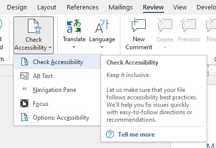
It will go through the document/spreadsheet/powerpoint/page and link to every thing it finds that might make a reader stumble. In the example below, the “Hard to read text control” is where the author has used a light blue text to set the text apart — but the AC is right, it would be hard to read if you had poor vision.
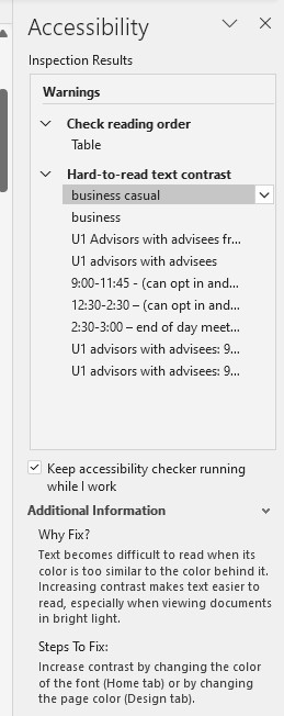
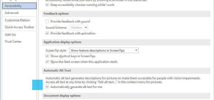
A very common AC remark USED to be “Missing Alt Text” — when you have a picture in your document but, if the person is using a Screen Reader, they won’t get information about the picture unless you have the ALt Text. Fortunately, now Microsoft uses Bing Image Search (yes, everyone makes fun of Bing, but you’d be surprised how effective it is in the background of a lot of your apps) and it pulls in Alt Text automatically for you for your pictures. It should be on by default, but you can check by going to the Accessibility Options you see at the bottom of the AC menu (top pic above)
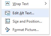
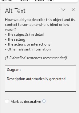
Of course, if you want to make the Alt Text of your image more precise, you can always do that by right-clicking the Image and choosing EDIT ALT TEXT.
If you’re interested in more Accessibility ideas, Microsoft has A LOT. In Canada, if you touch base with Fair Chance Learning http://www.fairchancelearning.com/ they have a great presentation for teachers on accessibility across Microsoft products, from Windows itself to the apps we use. I can’t recommend the session enough.
The biggest thing I’ve learned about increasing Accessibility is that it helps EVERYONE. And a lot of hidden accessibility issues get un-earthed when people find you’ve taken aspects into consideration. So, take a minute and click on the Checker and see where you could improve on your documents, presentations, spreadsheets & pages.
